
A Case Study in Product & Packaging Design

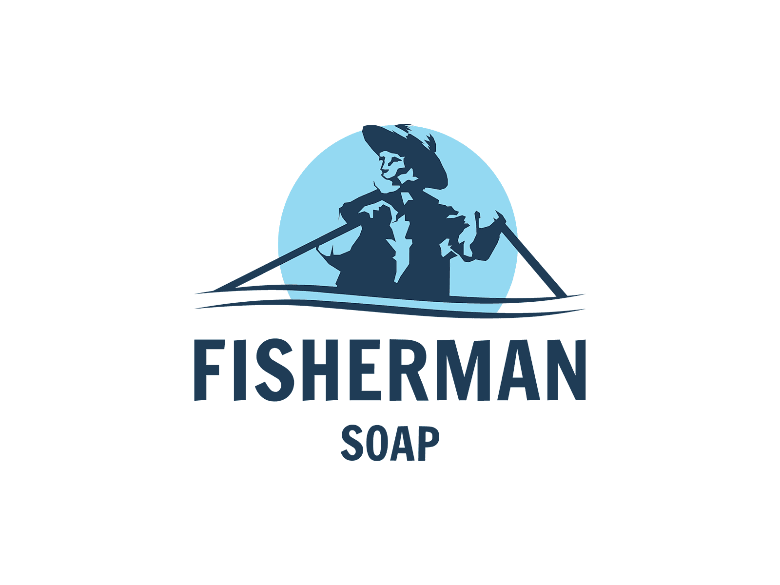
Packaging design is a place where honesty meets deception. With Fisherman Soap—it's a design that hits you like a shot of whiskey after a long day on the water. No frills, just raw, unvarnished truth. A fisherman stands there, casting his line into the deep, endless sea. You can almost smell the salt in the air, feel the grit under your nails.
The colors—they're not loud, not gaudy. They’re the colors of the earth, the kind that don't scream for attention but command respect. This isn’t some pretty package wrapped in lies. No, this is a promise. A promise of something real, something that can cleanse you anew.
The logo, it’s more than a logo. It’s a nod to the ones who wake before dawn, who fight the tide and the cold, who bring home the catch not because it’s easy but because it’s what they know. It’s a design that doesn’t pander. It doesn’t need to. It knows who it is and who it’s for.
And when you hold it, you’re not just holding soap—you’re holding a piece of that life. The life that’s honest, unyielding, and rough around the edges. Just like the packaging. Just like the fisherman.
—
The goal was to create a distinctive, print-friendly logo for the Fisherman Soap brand, and provide color and typeface guidance. The logo was inspired by Hemingway's The Old Man and the Sea.

Aug 30, 2024
